Tool: Pareto
Usage: Identifying the causes that have the greatest impact on a problem, which assists with determining where to focus an improvement effort
Pareto analysis is a simple technique that uses a bar graph to diagrammatically show the causes that have the greatest impact on a problem. This process helps to focus improvement efforts on the causes that have the greatest impact.
The Pareto Principle was developed by quality management guru Joseph Juran (1904-2008) and named after 19th Century Italian economist Vilfredo Pareto, who observed that 80% of the income in Italy was received by 20% of the population. The principle sets out that the majority of results in a given situation can be determined by a small number of causes (the ‘Law of the Vital Few’) – roughly 80% of results are achieved by 20% of the causes. It is also called the 80:20 rule
How to Construct a Pareto Chart
- Identify the problem and its possible causes (using some of the tools covered earlier).
- Collect data on the identified causes (e.g. frequency of occurrence, cost, etc.).
- Create a table and rank the causes from largest to smallest.
- Construct a bar graph with the causes along the horizontal axis and the frequency or cost on the vertical axis.
- An option step is to construct a cumulative bar graph that stacks the major causes of the problem. This enables the group to visually identify the ‘vital few’ that account for 80% of the effect on a problem.
Example
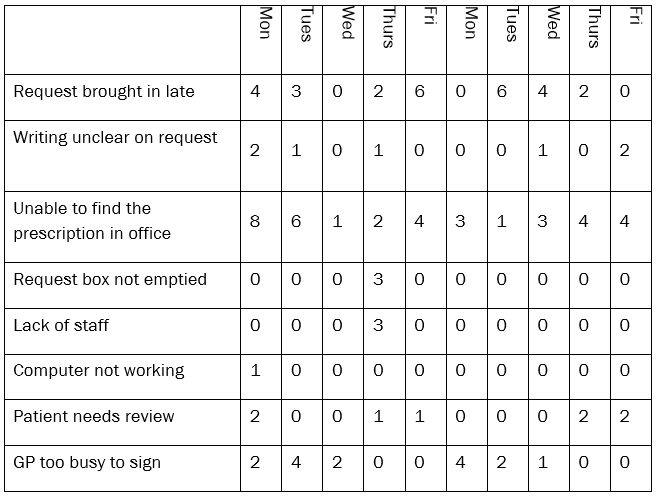
The table below looks at the problem of repeat prescriptions not being ready for collection at a practice. The causes identified as impacting on the problem are listed in the first column. Data collection occurred over a two week timeframe to determine the frequency with which each cause occurred, and the information is summarised in the table below.
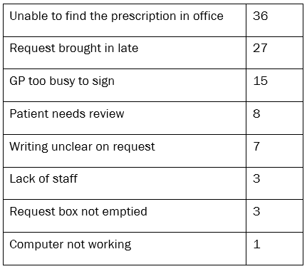
The next step involves collating and ranking the order of the causes, as shown below.
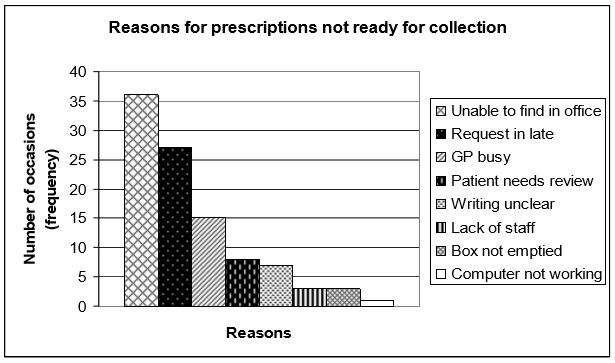
The data can be presented as either a bar graph or cumulative bar graph, as shown in the two diagrams below.
Bar Graph
Cumulative Bar Graph
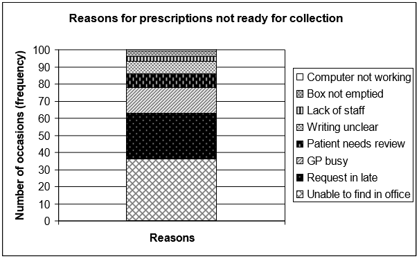
In this example, three reasons (causes) account for almost 80% of all the instances in which prescriptions were not ready for collection. The causes are: staff unable to find the prescription in the office, late requests from patients and the GP being busy. The team should start their improvement work by focusing on some or all of these three areas, as they will have the potential to make the greatest impact on the system.
Tips
- The numbers do not have to be 20% and 80% exactly – the purpose is to identify the causes accounting for the majority of the results.
- Where possible, avoid labelling causes as ‘other’ or ‘miscellaneous’, as this will make it difficult to determine solutions for these causes. Time should be taken to understand the actual cause and describe it accurately.